The forgotten features of Sourceforge
Table of Contents
Remember Sourceforge, where you’d download software in the 2000s? It’s now mostly dead, and the company running it has been trying to squeeze out as much profit from it as they can using questionable practices.
But despite that, it’s a software forge, and I think some aspects of its design remain interesting and could even be an inspiration for today’s forges. Let’s have a look at a sample FOSS project hosted on Sourceforge, Code::Blocks, with which I made my first programming steps some decades ago.
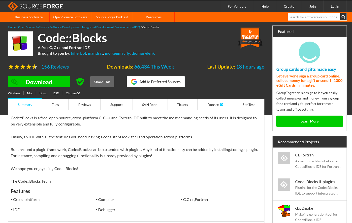
Compare that to your favorite GitHub project. There are so many differences! Here’s what I find striking.
A landing page designed for end users #
The Download button jumps to your face. There’s also a list of reviews (more about this below) and a “Support” Tab. The platform assumes you’re here to install, use, and get help for this software.
It’s clearly a user-centric design.
Compare that to the experience on GitHub. If you want to download a tool hosted on GitHub, you’ll need to, either:
- know your way around things and choose the “Releases” tab, take the latest release, scroll past the release notes down to the artifacts, select the one that’s relevant for your operating system based on the filenames (which can be somewhat cryptic) and download that
- or scroll past the file listing to the README, make your way through a forest of CI and code coverage badges, to reach a download link hopefully added by the developers to the README, probably still leading you to the release page anyway, where you’ll need to continue with the above!
It’s mind-boggingly hostile!
GitHub has made the deliberate choice to tailor the landing page of a project to a developer-centric viewpoint. Which probably explains its success among developers.
But how can developers afford to ostracize their users to that extent? Is it because software distribution is happening through other means anyway, such as app stores? Is it because they’re expected to make a website for their software (for instance via GitHub Pages) and keep users there? But then is it honest to expect users to file issues on GitHub when something doesn’t work as expected? Or take part to GitHub Discussions? Or even just leave a GitHub star? As an end user, you’re not even invited to create an account on GitHub anyway: it’s meant for developers, period. I can’t help but think that it would be preferrable not to drive such a wedge between the users and developers of a tool.
More meaningful than stars: reviews #
You can actually give your opinion about a piece of software on Sourceforge! You can even rate specific dimensions: “Ease” (of use), “Features”, “Design” and “Support”. And you can write a comment on top of that! Really cool!
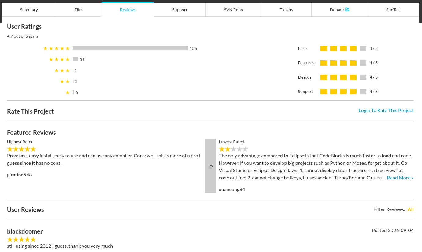
In comparison, GitHub stars are used as a proxy for project success all the time, but it’s a really poor signal. As a user I only have a binary choice: do I give a star to this project or not? And even if I do, the meaning is unclear: I can star a project because I’m a happy user of it, or because I want to remember to have a look at it later, or because I find the concept behind the repo funny…
Readable description comes before file listing #
Notice how the landing page doesn’t show a listing of the files in the repository? Instead, it shows a human-readable description of the project. The file listing is still accessible via the “Files” tab.
This makes so much sense, and not just for users, but also for developers. As a developer, when I go to a GitHub repository, a significant area of the page is just dedicated to showing me the file listing of the root directory, which will generally match the standard directory structure of whatever programming language or framework is in use. Of course, as a developper I can be interested to know which technology is used for this project, but this is a super inefficient way to convey that information.
Here’s my internal discourse when landing on such a page (slightly exaggerated, I concede):
Oh, they have a
.githubdirectory! They must be using CI with GitHub actions. And maybe Dependabot too. That’s good. And then they have asrcdirectory as well. Good! I love software which has… source code in its source code repository. And look what else is coming! Atestsdirectory! Wow, they are really rocking it, they got a test suite. And next… acoveralls.yml! Ah, the good old Coveralls service! I wonder if they know about CodeCov. Apackage-lock.json! This smells like a Javascript application, interesting :) …
You got the idea: I don’t need to see all those files when I’m just discovering a project.
Brought to you by a team, not an irreplaceable founder #
Notice how the header of the page says:
Brought to you by: killerbot, mandrav, mortenmacfly, thomas-denk
How refreshing! There’s a team behind this project!
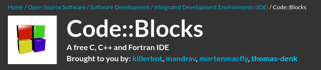
If we were on GitHub, it would rather look like this, with one of the maintainers listed as single owner and the others added as “collaborators” (whose list is not publicly visible):

or, perhaps somewhat better, the repo would be owned by a “CodeBlocks” organization where all maintainers would have been added, with only two of them being publicly visible because the others didn’t take the initiative to publish their membership… sigh.
I’m convinced that GitHub’s design has serious consequences on the way people relate to the projects they are involved in. By designating the repository creator as owner, the platform is making it harder to meaningfully share responsibilities, leading to burnout or abandoned software. I wrote earlier about the implicit feudalism that this creates.
Advertising related projects #
Another interesting feature of this landing page is the side-bar with recommended similar projects. The first one it lists is CBFortran, “A customized distribution of the Code::Blocks IDE for Fortran”.
It might not seem like much, but I find it an amazing feature.
I wrote earlier about the poor discoverability of forks on GitHub. The problem is simple: if a software project becomes unmaintained, it is very hard for the community around that software to coordinate and agree on a new repository where to continue the maintenance. All they can do is open an issue in the original project, where they announce the fork, but that will not be visible to people who arrive on the landing page of the project. If they are not able to discover an actively maintained fork, that means they might end up starting their own. This means a forest of forks, a ton of duplication of work, and a lot of frustration.
I don’t actually know how Sourceforge’s recommendations are computed and whether an active fork would organically appear there, or if it needs to be somehow vetted by the project maintainers. But I find it encouraging to see an alternative distribution for Fortran being listed in first position.
Any other feature? #
You made it to the end of my love letter to Sourceforge. Congratulations. As mentioned in previous blog posts, I’m currently working on Forgejo and those design considerations are motivated by that work. So stay tuned as I turn Forgejo into the new Sourceforge, with ads everywhere, promoted links and partner deals! ;)
If you have other pointers to interesting features, or have any comments about the thoughts above, I’d love to read them on Mastodon.